Nobody has actually died from watching a slide show presentation. That whole Death by Powerpoint thing was much exaggerated. What’s true is that countless people have been held hostage by interminable presentations often alleged to be a workshop at which nobody actually works and little is learned. And – true confession – I have been as guilty as anyone in this abuse in the name of education.
PowerPoint and its ilk have not been around for ever although it must seem like it to younger people. 1.0 came out of Silicon Valley in 1987 as a way to present on Macs. Microsoft bought it, the Windows version came next and the world of presentations was never the same again. Since then we’ve had really Bad PowerPoint (Seth Godin 2001) and Death by PowerPoint (Cherie Kerr, 2002). Godin wrote:
PowerPoint could be the most powerful tool on your computer, but it’s not. It’s actually a dismal failure. Almost every PowerPoint presentation sucks rotten eggs.
I made my first PowerPoint in the mid 1990’s. It was a report to the board of trustees and I worked on it all weekend (it was raining) discovering and adding and applying all kinds of cute animations and fonts and the like. I’m sure it was wonderful (!) and a step up from reading from a report or an interpretive dance.
In preparation for a recent workshop on the importance of family conferences I went back to a presentation I created on the topic in 1998. Took a while to dig it out of the digital storage brick but there it finally was in all its wordy glory. Words, bullets and more words stuffed on slides. I remember the process. I had written a paper on the why, what and how of Family Conferences as an alternative to the mission-inconsistent traditional parent-teacher meetings that excluded the most important person: the student. Basically it was an essay squished onto slides without the connective tissue of sentence construction.
This was long before the wonders of tools like Canva but I did add a couple of clumsy graphics and the school logo – how clunky and old-fashioned they seem now.
| I even added a link to a Monty Python clip. (There’s always a Monty Python episode to illustrate every absurdity of school life.)
This particular clip was to emphasis the doctrine of no surprises – the importance of preparing everyone before the conference so the time can be spent on exploring issues and developing problem-solving strategies and plans of action. So “No one expects the Spanish Inquisition” seemed on target. |
Guy Kawasaki advocated for the 10/20/30 Rule of PowerPoint in 2005. It’s quite simple: a presentation should have ten slides, last no more than twenty minutes, and contain no font smaller than thirty points.
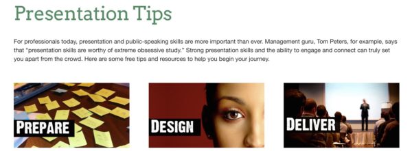
Since then the art of presentation has been further refined with the emphasis on effective visuals and the art of storytelling. Gar Reynolds of Presentation Zen has made it his mission to improve the lives of those subjected to Powerpoint by offering good clear advice. Here are his presentation tips:
Personally I usually get irritated with story tellers and find myself impatient with all the visuals. Give me the words to read and I’ll take it at my pace, my way. Thanks. But that’s me just my old-fashioned pre-TV era self.
And as for those slides with all the words – well they may break every rule for an effective presentation but they are a fantastic way to sort out and organize your thinking. And if you can’t reach the Elysian heights of perfect presentation then least do this do this: Prepare a hand-out or e-version with all the words. Prepare your spoken bit as best you can then and tell your audience: “Relax you don’t need to take notes. I’ll leave it all with you.” I’ll even try and take my own advice next time.
So for all the words – or many of them at least – on Family Conferences – here are word-packed slides.


I think you meant to say 1987 not 1887? 🤔❤️️
I think you are correct! Thanks for noticing.